Imagine your product owner or designer proposes a new feature: a select component where you can choose a person and see their avatar and job title. Let's call it the PersonSelect component. It would look something like this:
Most people typically consider one of two options:
- Using a Prebuilt Component.
- Build the Component from scratch.
Each option comes with its own set of challenges. In this article, I'll walk you through these challenges and propose an alternative solution that I believe is better.
Let's begin with the first option.
Using a Prebuilt Component
When I’m talking about a Prebuilt Component, I’m referring to one of two things. Larger component libraries with various components, like Material UI. Or a library/package specifically built to solve a certain problem, like react-select, for a feature complete Select component.
Most Prebuilt Components allow customization through themes, configuration files, or changing CSS. But if you're like me, you often struggle with the embedded styling of Prebuilt Components.
I find myself overriding styles with hacky solutions or dealing with missing features of the Prebuilt Component. I want to create the best user experience possible for our use case, but the library/package is holding me back.
If we try to build the PersonSelect component with Material UI, we might end up with something like this:
This looks acceptable to me, but the designer probably won’t be happy. You can still recognise Material UI, especially the signature ripple effect indicating a user press. We could try to remove these things, but again, we’d be working against the library.
The good thing is the component works as expected, and we didn’t have to do much to get this functionality. We only modified some styling and kept track of the selected person, which is the stuff we want control over.
But we still have another option to consider.
Building from Scratch
Alright, let's explore building the PersonSelect component from scratch. I already know that the native select HTML element falls short in terms of styling, so we will need to create something custom.
Looking at the component we need to:
- Show the currently selected option.
- Toggle the list of options when clicking on the currently selected option.
- Be able to select another option.
Here is what that might look like:
Pretty neat, right? Let’s ship it.
Not so fast! This component has several issues. It attempts to mimic the native select element with custom styling but lacks essential functionality:
- Keyboard interaction. In a native
select, you can navigate between options using the arrow keys and type to select an option. Our component doesn't support this. - Focus management. Options in a native
selectclose automatically when focus shifts away. Our component doesn't manage focus at all. - ARIA and screen reader support. A native
selectelement has built-in screen reader support. Our component looks like a select, but it doesn't indicate anywhere in the code that it is a select, affecting accessibility. - Collision-aware positioning. A native
selectadjusts its position based on available screen space, opening above or below the selected options as needed. Our component doesn't handle this positioning.
Here you can see me trying to click away to close the options, or use the arrow keys to navigate the options. This does not work. Then, when I try to tab away, I start cycling through the options. Very frustrating.
We can try to address all these problems but we would end up with a LOT more code. This component will become a headache to test and maintain. Suddenly, just using a Prebuilt Component is looking like the better option here.
Building good interaction is really challenging. Users expect a lot from your components, and you need to accommodate a diverse range of users with different preferences and accessibility needs.
Lately I've been using a different approach.
Headless UI
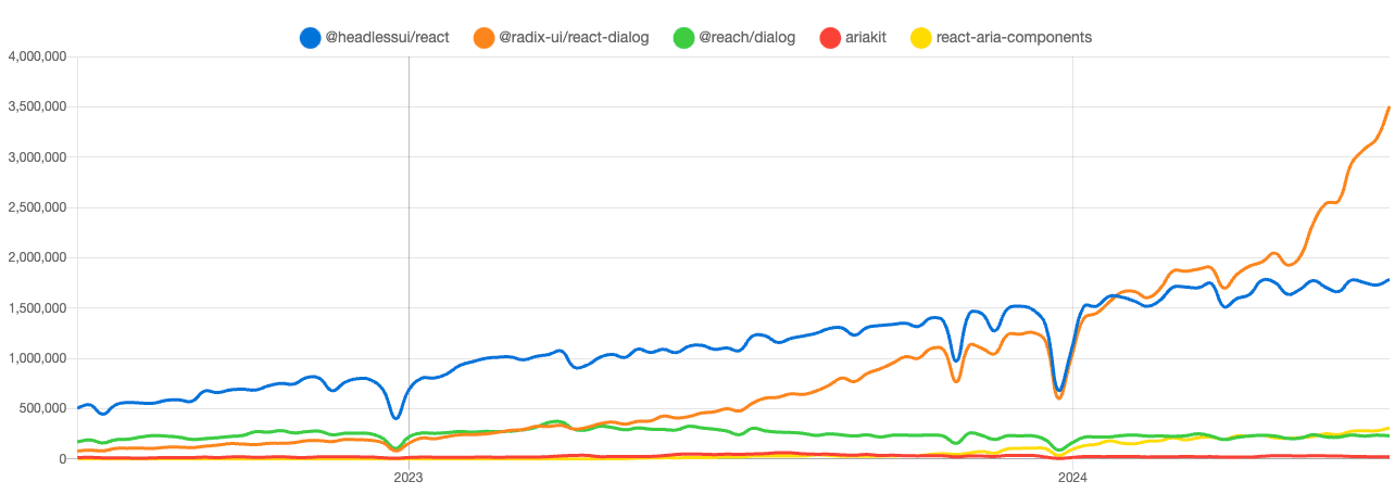
"Headless" in this context means without overhead. Although the term Headless UI has been around for some time, it's now gaining popularity, with an increasing number of libraries adopting this approach. Most notably, the similarly named @headless-ui/react from Tailwind Labs.
So, what is it?
It’s “Bring your own UI” [1]. It’s “unstyled primitive components” [2].
The key distinction from Prebuilt Components and Component Libraries, is that Headless UI provides the building blocks to create your own components. You have complete control over the design and, sometimes, even the HTML structure.
“What does it even do, then?” you might ask.
Well, it kinda depends on the library. But the main themes are:
- Common interaction patterns.
- Cross browser and device compatibility.
Let’s dive into those.
Common Interaction Patterns
The web support plenty of interaction patterns. For example, a button to press or an input element for entering text.
Headless UI libraries can offer new interaction patterns that the web platform doesn't provide. An example of a new component is the Combobox. A Combobox combines an input element and a select element, letting users search through options and select one or more. This component is not provided by browsers in any way. People have come to expect this pattern when dealing with large datasets and long lists of options. The Web Accessibility Initiative (WAI) has described the Combobox Pattern in detail.
Headless UI libraries can also improve existing patterns that are currently not flexible enough. A good example of an improved component is the Select (also called Listbox) component. This component aims to replace the native select element, which is difficult to style, giving you full control over the styling.
Most Headless UI libraries come with support for comboboxes and listboxes.
Building the PersonSelect component.
Alright, so what happens when we try to build the PersonSelect component again, but now with @headless-ui/react?
Loading the library and setting up the select (listbox) looks like this:
There is no styling! This might not be surprising given the title of this blog post, but think of the possibilities. We don't need to use hacky methods to override the default styling of a component because we have complete control over every HTML element and every line of CSS. For now, we can simply reuse the styles from the “build from scratch” example.
Looking at the code, the end result is pretty similar to the “from scratch” example. We focus mainly on UI elements and keeping track of the selected person. The component remains super readable, but we also gained some additional features. I’ll highlight a few of them:
Keyboard interactions
Using the arrow keys, we can navigate through the options. Using enter, we can select a new option. Escape closes the select and refocuses the ListboxButton element.
We can even start searching through the options by typing the first character(s) of an option.
Focus management
There are two focusable areas in this component. We have the ListboxButton element, which is always visible and focusable. Next we have the ListboxOptions element, which becomes visible and focused upon opening the select. The individual ListboxOption elements are not focusable because we can navigate through them using the arrow keys. When the user selects an option, the focus is restored to the ListboxButton element.
ARIA
ARIA (Accessible Rich Internet Applications) declarations are added, following the listbox pattern. This helps screen readers understand and describe the interactive elements on the screen, making the content more accessible to all users.
Positioning
The default position for the options list is below the currently selected option. If we scroll so the UI element is at the bottom and try to open the options, they are shown above the currently selected option.
These are the kinds of features that take time and effort to implement correctly, but they are also what makes a UI great instead of just good.
Now, onto the next point Headless UI libraries can help us with.
Cross browser and device compatibility
The web can be accessed almost anywhere—different browsers, render engines, devices, and interaction methods.
Our web apps need to function everywhere, preferably with a great experience. Headless UI libraries can help create seamless experiences across different browsers and devices.
I’ll give an example using a simple button. Let’s say we have an outlined button that inverts its colors when hovered over with a mouse.
This looks good, so let's ship it. But wait, let's test it on a mobile device first.
When testing on a real mobile device (not just shrinking the viewport), we might see some strange behaviour we didn't expect. The button goes to its hovered state...
The web was originally designed around mouse events. When touch devices emerged, browsers added support for touch events but also needed to emulate mouse events to maintain compatibility with existing web apps.
Some Headless UI libraries offer (opinionated) solutions for handling things like hover and focus states making it easier to implement consistent and accessible UI interactions.
Although it’s not immediately visible, we do benefit from these features with our Headless UI implementation of the PersonSelect component. We get:
- No unintended hover styles on mobile.
- Beter “pressed” states.
Finally, let’s take a look at a couple other ways we can benefit from this Headless UI pattern.
Other
For lack of a better name, I’ve categorised these into the “other” category. These patterns provide functionality but allow you to keep control over styling and HTML structure.
Data grids
Mostly used in administrative systems, these can become fairly complex. With functionality like sorting, filtering, pinning columns, grouping columns etc…
I really recommend TanStack Table for this and encourage you to read their motivation/introduction, which also offers a great explanation of headless UI.
Transitions and Animations
While CSS can handle animations, there are cases where its functionality falls short, such as creating an “exit animation” before a component is unmounted. A good example of how this can be solved is the AnimatePresence component from Framer Motion.
Forms
Forms can be very complex. Conditional fields, validations, having a dynamic amount of fields etc… Two examples: React Aria has built in support for different form components. And react-hook-form is great for handling complex logic in forms.
Conclusion
Building good interactions is challenging. Users expect a lot from your components, and you need to accommodate a diverse range of users with different preferences and accessibility needs.
So the next time a Product Owner asks you to build a complex component, consider to use a Headless component library.
I wanted to end with a quote from Merrick Christensen, who wrote a great article on Headless User Interface Components back in 2018:
“Wait for a second, are you advocating a user interface pattern that doesn't have a user interface?”
Yes. That is exactly what I'm advocating. [4]